La Vista
Virtual art gallery experience enabling immersive 360° tours when in-person visits aren't possible
Overview
La Vista is a virtual tour application concept designed for an Italian art gallery, enabling art enthusiasts to experience exhibitions through immersive 360° virtual tours when in-person visits aren't possible. This design project addressed the critical need for accessible cultural experiences during the COVID-19 pandemic whilst creating lasting value for diverse audiences.
The Problem
During the COVID-19 pandemic, arts organisations faced unprecedented challenges. Lockdowns and event cancellations severely limited public access to galleries, artists lost crucial platforms for showcasing their work, and geographic and financial barriers prevented many from experiencing art exhibitions.
The Solution
A prototype for an iOS virtual gallery tour application that addresses these challenges through:
- Immersive 360° virtual tours that replicate the in person gallery experience
- Flexible viewing options including self guided and curated tours
- Prioritised accessibility through multiple languages and assistive technologies
- Enabling artists to reach broader audiences beyond physical limitations
My Role & Responsibilities
As the sole UX designer on this concept project, I owned the complete design process from research through high-fidelity prototyping in Figma:
- User research: Conducted interviews with 6 participants (ages 20-65) and competitive analysis of 4 Italian art galleries
- Design: Created sketches, digital wireframes, and high-fidelity interactive prototypes in Figma
- Testing: Planned and conducted two rounds of usability studies with iterative improvements
Research & Discovery
User Research
I conducted semi-structured interviews with 6 art gallery visitors to understand their needs, behaviours, and pain points around virtual gallery experiences. The research focused on understanding motivations, barriers, and preferences for virtual art consumption.
Key Research Questions
- Have you experienced virtual gallery tours before? What did you like or dislike?
- When visiting galleries, do you prefer self-guided or guided experiences?
- What appeals to you or deters you from virtual gallery tours?
- Would VR technology enhance your virtual gallery experience?
Key Insights
The research challenged my initial assumptions and revealed unexpected use cases:
Virtual tours as scouting tools
Users wanted to preview exhibitions before committing to in person visits, not just as a replacement for physical attendance
Context matters
Participants emphasised the importance of seeing artwork within its gallery setting and spatial relationships, not just isolated images
Convenience drives engagement
Easy access (no travel, no cost, home comfort, multiple languages) significantly increased likelihood of viewing exhibitions
Identified Pain Points
- Time: Many users lack time for in person gallery visits due to busy schedules
- Pandemic: COVID-19 lockdowns made in person visits impossible at times
- Resources: Travel costs and geographic distance create barriers, especially for non local visitors
- Accessibility: Existing virtual tours lack multilingual support and assistive technologies for users with disabilities
Competitive Analysis
I analysed four Italian art galleries offering virtual tours to identify market gaps and opportunities. The audit revealed consistent weaknesses in language support, accessibility features, and navigation simplicity across competitors.
Key Findings
- Limited multilingual support: Most competitors only offered tours in Italian
- Accessibility gaps: Audio descriptions and alternative viewing formats were rarely available
- Complex navigation: Users faced multiple steps to reach desired exhibitions
- Limited viewing options: Few offered both 360° immersive tours and traditional slideshow formats
Opportunities Identified
- Differentiate through accessibility features (audio descriptions, multiple languages, screen reader compatibility)
- Provide flexible viewing options to accommodate different user preferences and technical capabilities
- Simplify navigation to reduce friction between users and exhibitions
- Offer free access to maximise reach and reduce barriers
User Personas
Based on the research findings, I created two personas to represent the primary users: art enthusiasts seeking accessible gallery experiences.

Sarah
Travel enthusiast
Quote
"I love to experience the art and culture from all kinds of places and I don't wanna miss out on anything"
Background
Sarah loves to travel and doesn't like to miss any attractions a place has to offer. Sometimes Sarah gets frustrated by spending her time at places that don't interest her and would love to have a sneak preview of the galleries before she makes her trip to help her plan her day.
Goals
- Travel to new places and experience the culture while relaxing on a stress free holiday
- See as much as she can that interests her
Frustrations
- It can be hard to fit everything Sarah wants to see into your schedule
- It can be hard to decide what is worth her time

Jordan
Full Time Student
Quote
"I wanna save my money to travel and view art from all parts of the world"
Background
Jordan is in his second year of studying History of Art and Architecture in Trinity college Dublin. As part of his college assessment Jordan often has to critically analyse artwork. As a full time student he does not have much disposable income to spend travelling to and attending art galleries. He relies a lot on online images to view artwork, but he finds it frustrating at times to critically analyse the work without physically experiencing it in the exhibition environment.
Goals
- To be able to attend many art galleries and view the works in their intended settings
- To be able to critically analyse works in their intended settings
Frustrations
- Lack of money and resources to attend galleries in person
- Art is located all over the globe and not easily accessible
- Hard to truly experience the work based off still images
Design Process
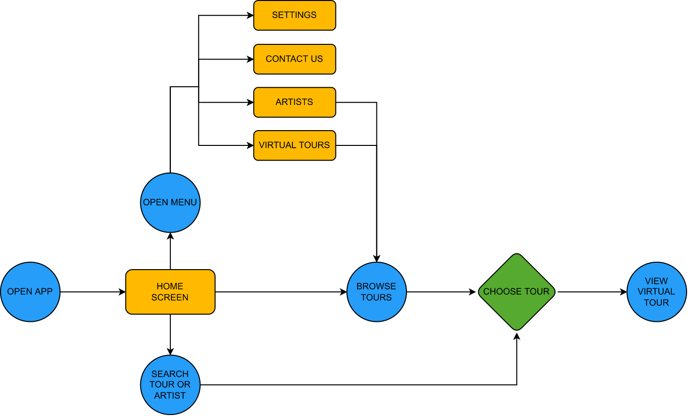
Information Architecture
I mapped out the user flow to ensure intuitive navigation from app launch to virtual tour completion. The architecture prioritises direct access to exhibitions whilst maintaining easy access to secondary features like artist information and settings.
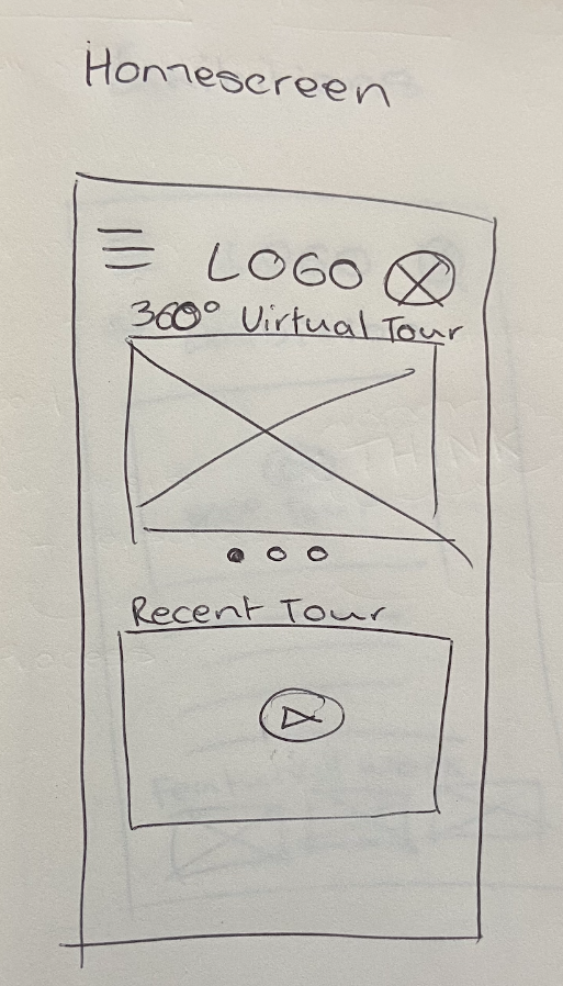
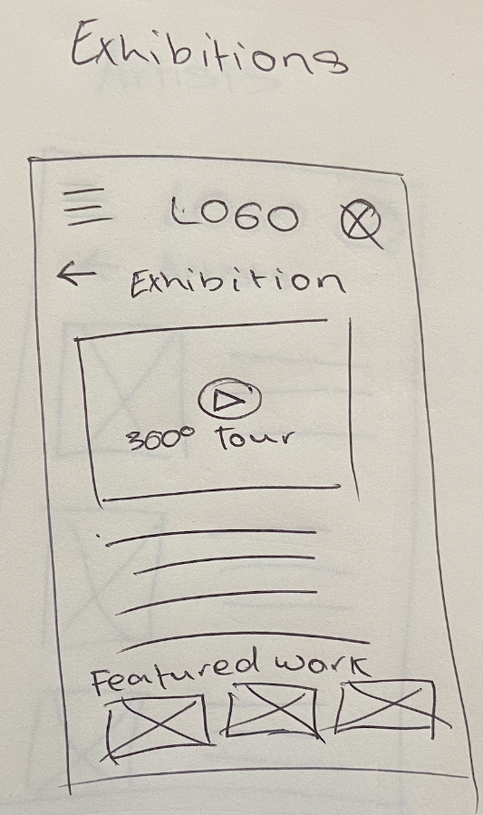
Sketching & Wireframing
I began with rapid sketching to explore multiple layout approaches before committing to digital designs. This allowed me to quickly test different navigation patterns and content hierarchies without the constraints of design tools.
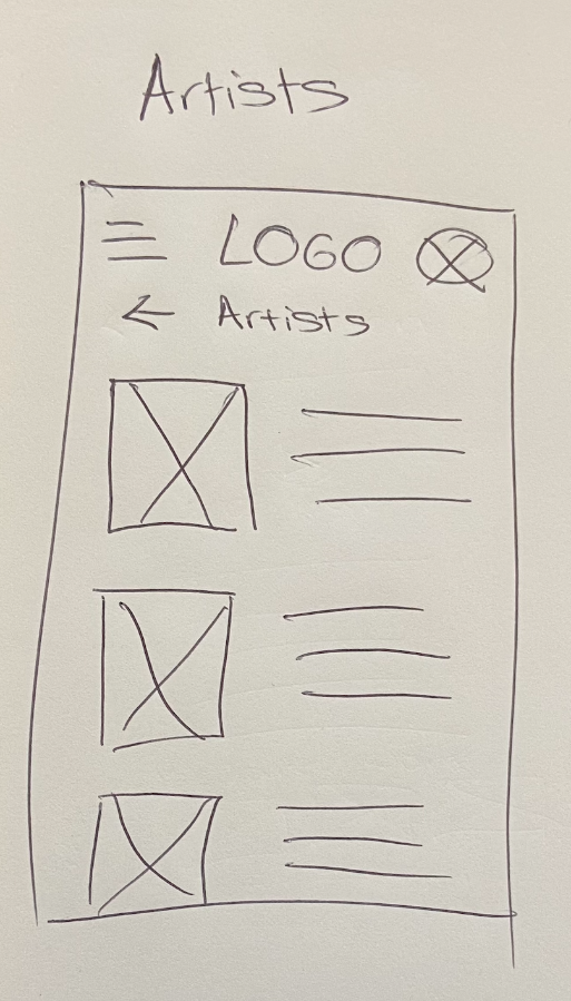
Digital Wireframes - Key Decisions
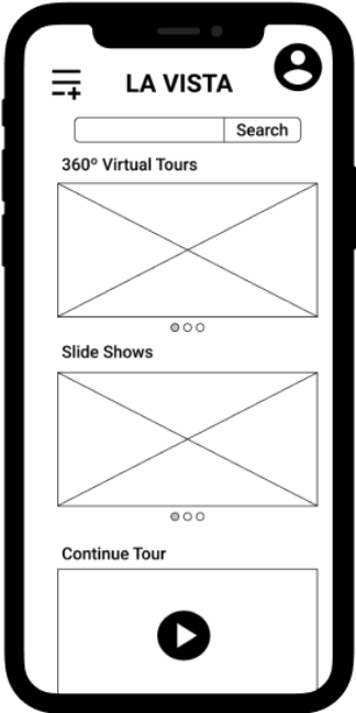
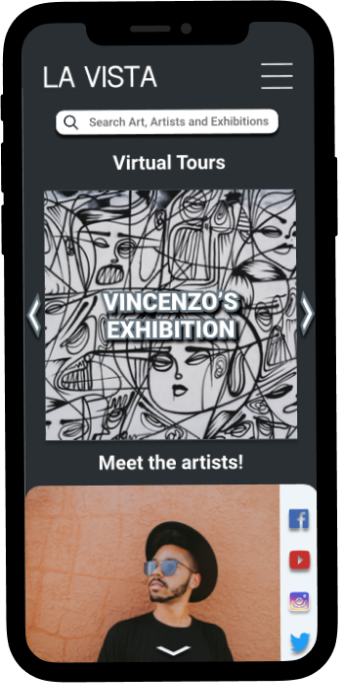
- Home screen: Featured all available exhibitions in a hero slider for immediate visibility
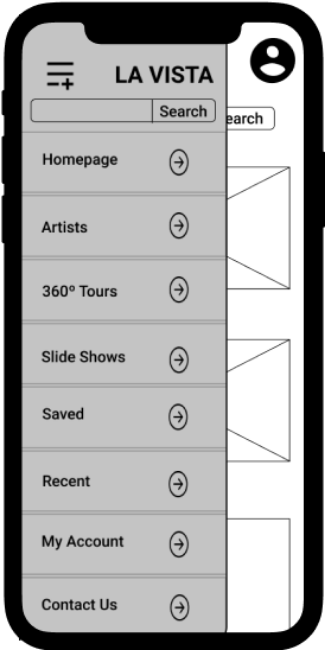
- Navigation: Clear, recognisable menu icon with minimal taps to reach any feature
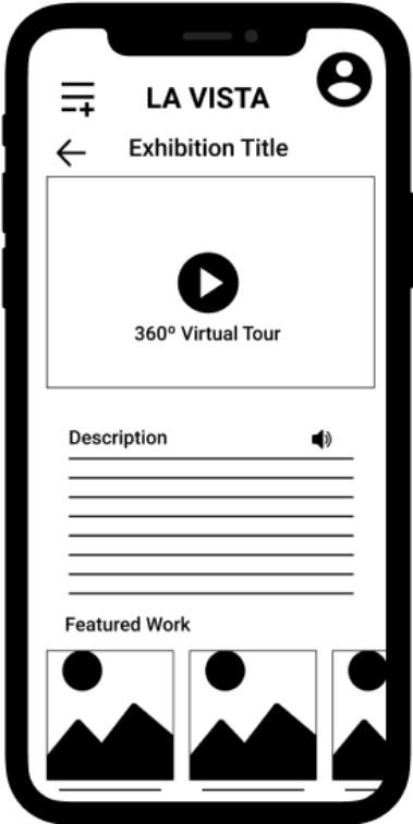
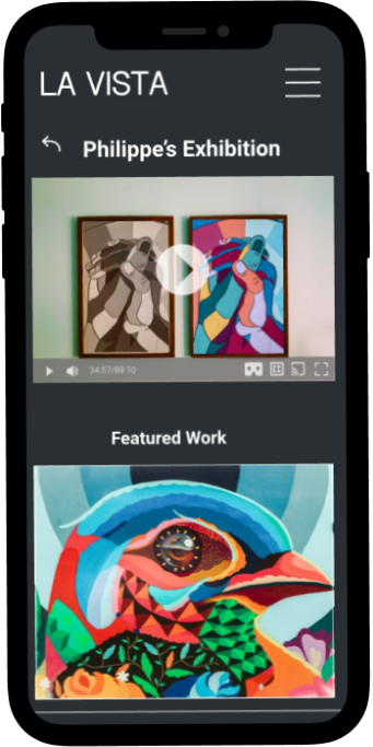
- Exhibition page: Primary CTA for 360° tour prominently placed, with alternative slideshow option clearly available
- Accessibility: Audio description icons paired with all written content
Testing & Iteration
I conducted two rounds of remote, unmoderated usability testing with a total of 14+ participants. Users completed key tasks whilst screen recording, allowing me to identify friction points and validate design decisions through both qualitative feedback and quantitative task performance metrics.
Round 1: Low-Fidelity Prototype Testing
Initial testing was conducted with low-fidelity wireframes using a similar task-based methodology. Participants navigated the basic structure and flow whilst providing feedback on information architecture and core functionality.
Critical Issues Identified
Missing Back Button
Users frustrated when forced to return to main menu for simple navigation backward
Contact Placement
Users instinctively scrolled to page bottom for contact information, but it was only in menu
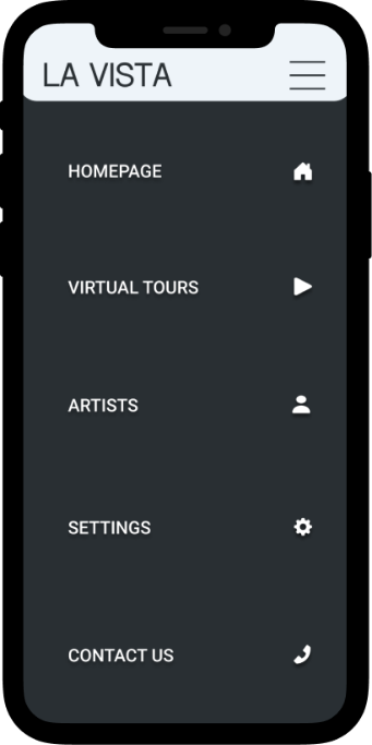
Menu Recognition
Custom dashed-line menu icon wasn't universally recognised as navigation
Changes Implemented
- Added persistent back button for one-step navigation backward
- Moved contact information to page footer following established patterns
- Reverted to standard hamburger menu icon (three horizontal lines) for universal recognition
Round 2: Refined Prototype Testing
I conducted remote usability testing with 9 participants using the high-fidelity Figma prototype. Participants completed four key tasks whilst providing difficulty ratings and qualitative feedback.
Task Performance Results
- Navigate to specific exhibition: 78% Very Easy, 100% Easy/No Issues
- Find contact information: 100% Very Easy
- Switch to dark mode: 67% Very Easy, 89% Easy/No Issues
- Navigate through artwork slideshow: 78% Very Easy, 100% Easy/No Issues
Key Findings from User Feedback
Whilst quantitative results were strong, qualitative feedback revealed important refinement opportunities:
Menu icon confusion persisted
"When I click 'Menu' on the navigation menu, I expected it to bring me back to home page because it has house/home icon, but somehow the icon works like a close button."
— Participant feedback
Dark mode inconsistency
"Dark mode could change the Meet The Artist textboxes dark too"
— Participant feedback
Overall positive reception
Multiple participants commented "great work overall," "very easy to use," and "it looks amazing" — validating core navigation improvements from Round 1
— Participant feedback
Design Refinements Based on Testing
- Reverted to standard hamburger menu icon (three horizontal lines) for universal recognition and eliminated home button confusion
- Extended dark mode styling to all UI elements including artist information boxes for visual consistency
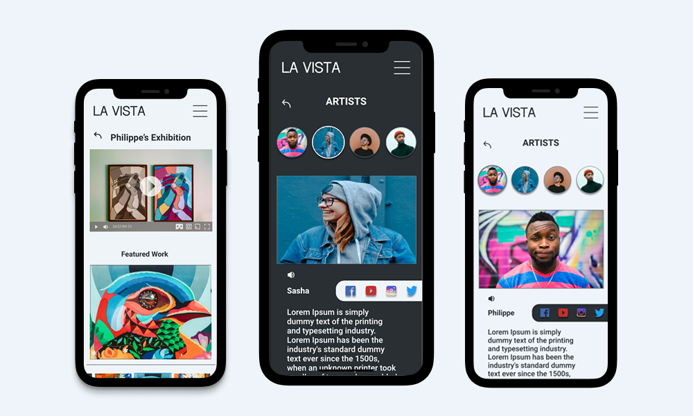
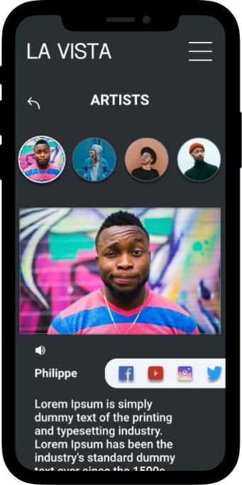
- Redesigned artist page with improved name placement within images and clearer distinction from gallery contact information
- Added directional arrows to exhibition carousel after several users didn't recognise the swipe functionality
- Standardised exhibition labelling across home and virtual tour pages for better consistency
Final Design
Branding
Color Palette
Typography
Roboto Bold
Roboto Regular
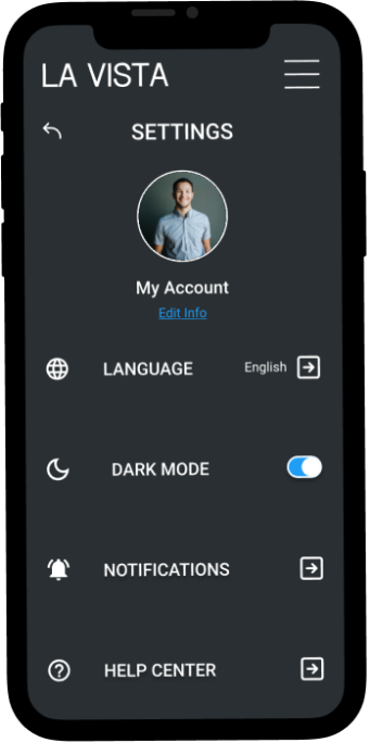
Accessibility Features
Accessibility was a core design principle throughout the project, informed by competitive analysis gaps and user research insights.
- Audio descriptions: Available for all text content to support visually impaired users and those who cannot read
- Multilingual support: App content available in multiple languages via settings menu, with icons alongside text for easier navigation
- Dark mode: Full dark theme available for users sensitive to bright light or those with visual impairments
- Flexible viewing modes: Choice between 360° immersive tours and traditional slideshow format accommodates different technical capabilities and preferences
Key Features
- Immersive 360° virtual tours providing spatial context and realistic gallery experience
- Alternative slideshow mode for users with limited bandwidth or motion sensitivity
- Dynamic homepage that updates artist information based on selected exhibition
- Direct links to artist social media profiles for deeper engagement
- Streamlined navigation requiring minimal taps to access any exhibition
Reflection & Learnings
Key Takeaways
Challenge assumptions through research: I initially assumed virtual tours would only serve users unable to attend in person. Research revealed that many users valued virtual tours as preview tools before committing to physical visits—an insight that significantly influenced feature prioritisation.
Usability testing reveals hidden friction: Watching users interact with the prototype exposed issues I couldn't identify on my own. The missing back button and confusing menu icon were immediately apparent when observing real usage patterns.
Design for users, not personal preference: I learnt to separate my aesthetic preferences from user needs. Several design elements I favoured were confusing to users and required revision based on testing feedback.
What I Would Do Differently
- Further simplify the design: Incorporate more white space and reduce information density, particularly in the contact footer which still feels cluttered
- Prioritise accessibility earlier: Focus on accessible design from wireframing stage rather than visual appeal, ensuring features like screen reader compatibility are built into the foundation
- Test with diverse users: Include participants with disabilities and those using assistive technologies in usability testing to validate accessibility features
- Expand multilingual testing: Test with non-English speakers to ensure language switching and translations work seamlessly
Future Enhancements
Whilst the MVP focused on core functionality, I identified several features for future development:
- Save functionality: Allow users to bookmark favourite artworks for easy retrieval and collection building
- Enhanced accessibility profiles: Dedicated profiles for cognitive disabilities and ADHD with simplified layouts and improved focus management
- Screen reader optimisation: Full compatibility testing and optimisation for VoiceOver and other screen reading technologies
- Social features: Share favourite artworks with friends and create collaborative collections
- Exhibition notifications: Alert users when new exhibitions from favourite artists become available
Impact & Takeaways
This concept project demonstrates how thoughtful UX design can address real-world accessibility barriers in cultural institutions. By prioritising inclusive design, flexible viewing options, and intuitive navigation, La Vista creates a platform that serves diverse user needs—from students conducting research to art enthusiasts previewing exhibitions before travel.
The project reinforced that virtual experiences can complement rather than simply replace physical gallery visits, expanding audience reach whilst respecting the unique value of both modalities. Through iterative testing and user-centred design, I created a prototype that balances technological innovation with genuine user needs.