The Grading Company
Designing an engaging Pokémon card grading experience with comprehensive research, usability testing, and community-focused features

Project Overview
The Grading Company is a Pokémon card grading company for collectors to get their cards graded and authenticated. Users submit their cards to the company where they will be authenticated, coded and encased. Each card is graded between 1 and 10, with a 'Mint Gem 10' being the best grade a card may receive.
The market is currently flooded with card grading companies, however none of the companies are providing the standard of experience that The Grading Company wanted to provide. Currently the experience for getting your cards graded is very basic. You submit your cards and then they're sent back to you in the new casing.
Many collectors are passionate about their Pokémon cards and the process of getting them graded should be an exciting experience.
The Problem
The card grading market is saturated with companies offering basic, transactional experiences. Collectors are passionate about their Pokémon cards, but the grading process doesn't reflect that passion. The experience lacks excitement, community engagement, and theatricality that would match the emotional investment collectors have in their cards.
The Goal
The goal of The Grading Company (TGC) is to offer a better card grading experience than any of the competitors can.
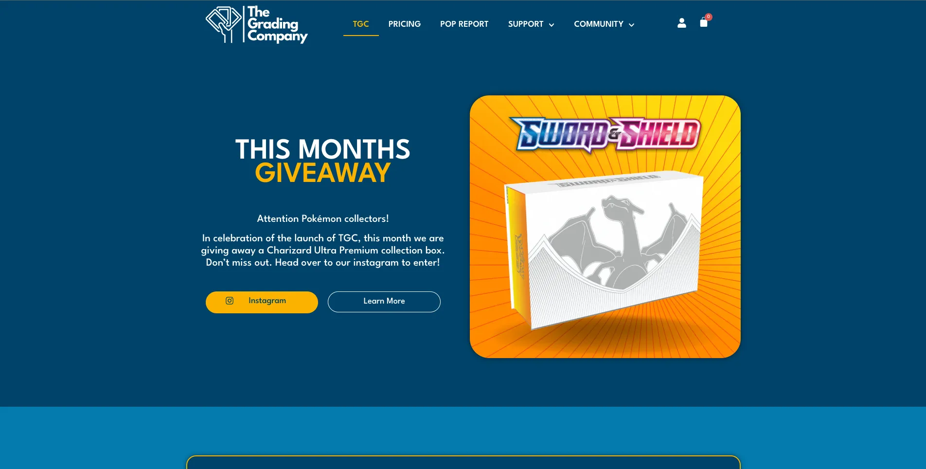
The main focus is to create a sense of community with collectors by offering more than just grading. TGC wants to engage its users with exciting giveaways, blog posts and monthly newsletters.
Another priority is to make the actual grading process more of an event by sending the cards back to the customer in a beautifully designed box which holds their cards in a flush foam case. Rather than just opening an envelope and seeing their graded card, the box adds more theatrics and excitement as they lift the lid and reveal their official grade.
Each card is tagged with NFC technology making the process even more immersive for the customer. When they tap their phone against the card it will automatically generate an official certificate for their graded card.
Research & Discovery
Competitor Analysis
I began by conducting a thorough competitive analysis of prominent Pokémon card grading companies in the UK. This entailed a meticulous examination of their websites, services, user experiences, and content strategies. By dissecting the strengths and weaknesses of these competitors, I gained valuable insights into industry trends, user expectations, and opportunities for differentiation.
I analysed four major UK competitors: Professional Sports Authenticator (PSA), Ace Grading, Majesty Grading Company (MGC), and Tree Frog Grading.
Key Insights from Competitor Analysis
Submission Process
Allow the customer to fill out submission details in their own time, avoiding rushed in-person forms
Turnaround Times
Current industry turnaround times can be improved significantly
Transparency
Free shipping and no hidden costs are highly valued by customers
Checkout Experience
Offer express checkout and make the process as simple as possible
Unboxing
The final product unboxing experience can be dramatically improved
Client Interviews
Beyond the analytical aspects of our research, I engaged in in-depth interviews with the client. These conversations provided invaluable context for our project. The client emphasised the importance of community within the Pokémon card world. They expressed a heartfelt desire for the website to go beyond grading and become a place for passionate individuals to connect, share their experiences, and indulge in their collective love for Pokémon cards.
Client Interview Insights
Community Engagement
Free monthly giveaways to show the community that we care
Regular Connection
Monthly newsletter to connect with users and keep up with the community
Content Strategy
Blog posts to provide informative and engaging content that promotes discussion and interaction
User Research
I conducted interviews with 5 collectors ranging from ages 20-65 years. These interviews focused on the user's experience in getting their collectable cards graded. I asked open-ended questions and encouraged people to expand on their answers to ensure I fully understood their input and to avoid my own bias.
User Pain Points
Submission Process
The submission process was awkward and confusing for users
Delivery Experience
The delivery of the final graded card was anticlimactic and disappointing
Hidden Costs
Expensive shipping and hidden costs frustrated users
Wait Times
Lengthy turnaround times left users feeling disconnected from the process
User Persona
Based on the research findings, I created a persona to represent the primary user: passionate Pokémon collectors who value community, authenticity, and an engaging experience.

Ashlynn Summers
Pokémon Enthusiast
Background
Ashlynn is a passionate Pokémon enthusiast with a deep love for collecting and trading Pokémon cards. She has been a fan since her childhood, and her collection has grown significantly over the years. Ashlynn enjoys attending Pokémon events, trading cards with fellow enthusiasts, and participating in online forums dedicated to Pokémon.
Goals & Needs
Ashlynn enjoys connecting with other collectors and sharing her collection with them. A website that offers community, discussions, and the ability to connect with fellow Pokémon enthusiasts would be appealing to her. She values a grading service that is trusted within the Pokémon community and looks for transparent and honest grading practices that align with industry standards.
Challenges
Ashlynn is cautious about counterfeit cards and wants assurance that the grading service can detect fake Pokémon cards accurately. With a busy work schedule, she finds it challenging to stay updated with the latest developments in the Pokémon card collecting community.
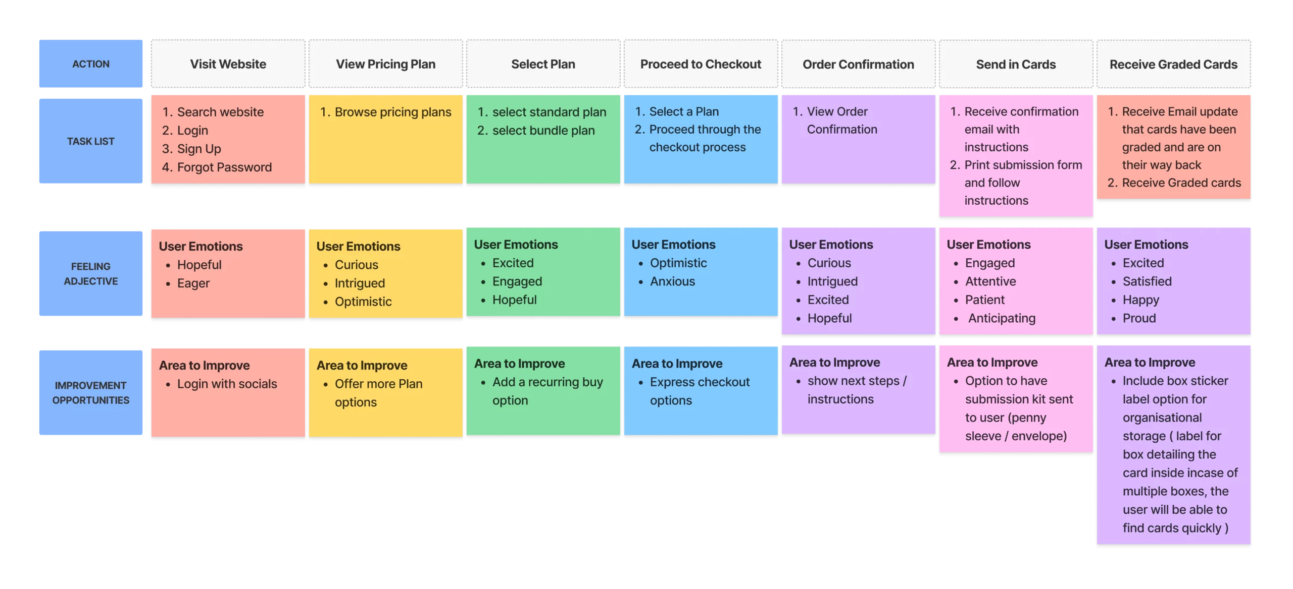
User Journey Map
I mapped out the complete user journey from discovering the service through to receiving their graded cards, identifying key touchpoints and opportunities for delight.
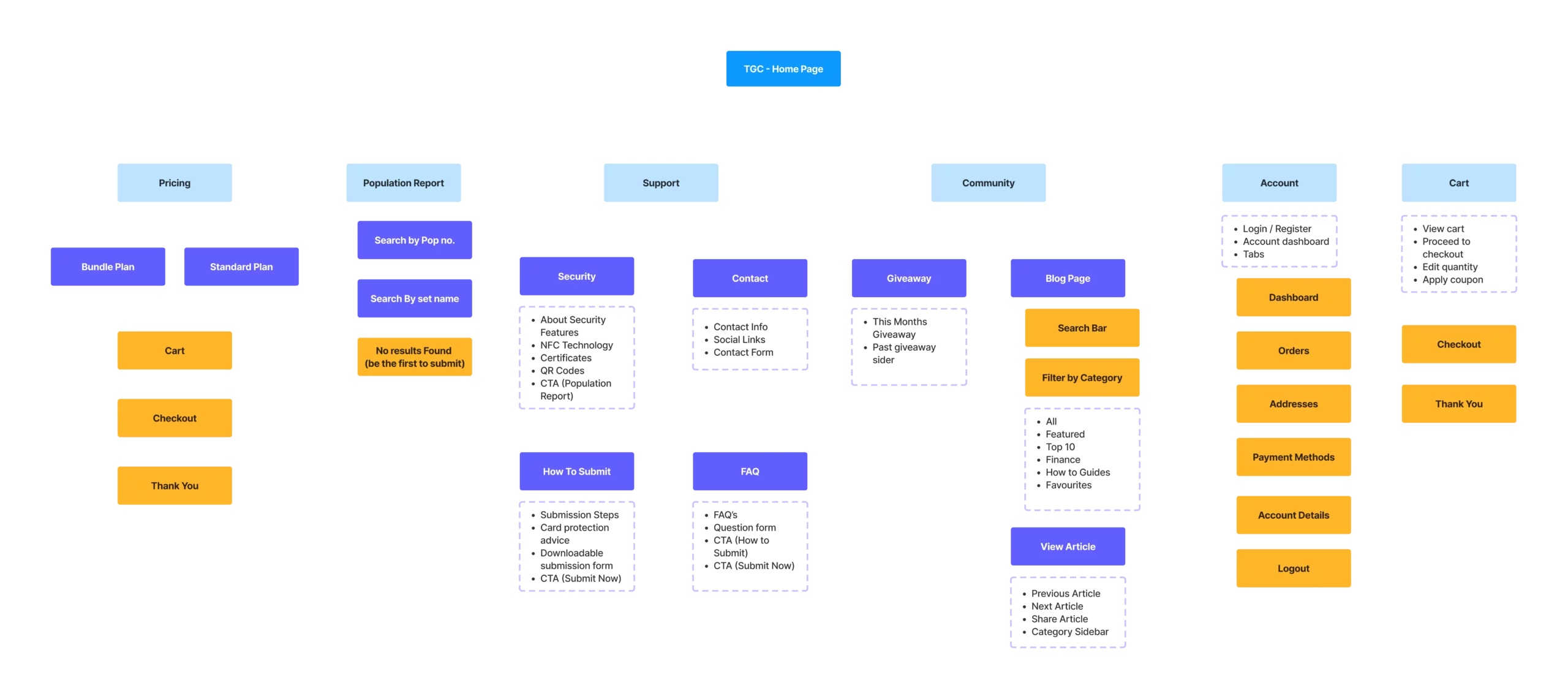
Site Map
I developed a comprehensive site map to ensure all necessary functionality was accounted for while maintaining a simple, intuitive navigation structure.
Design Process
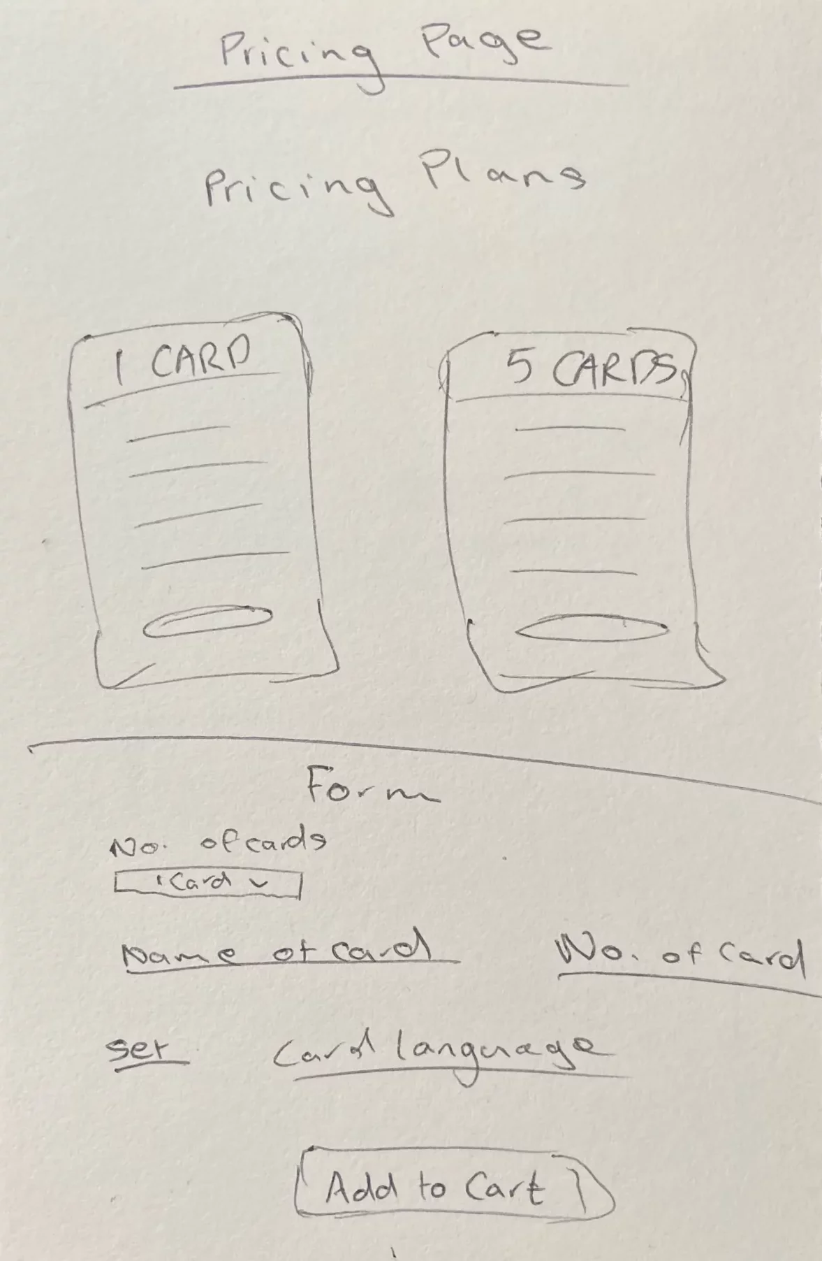
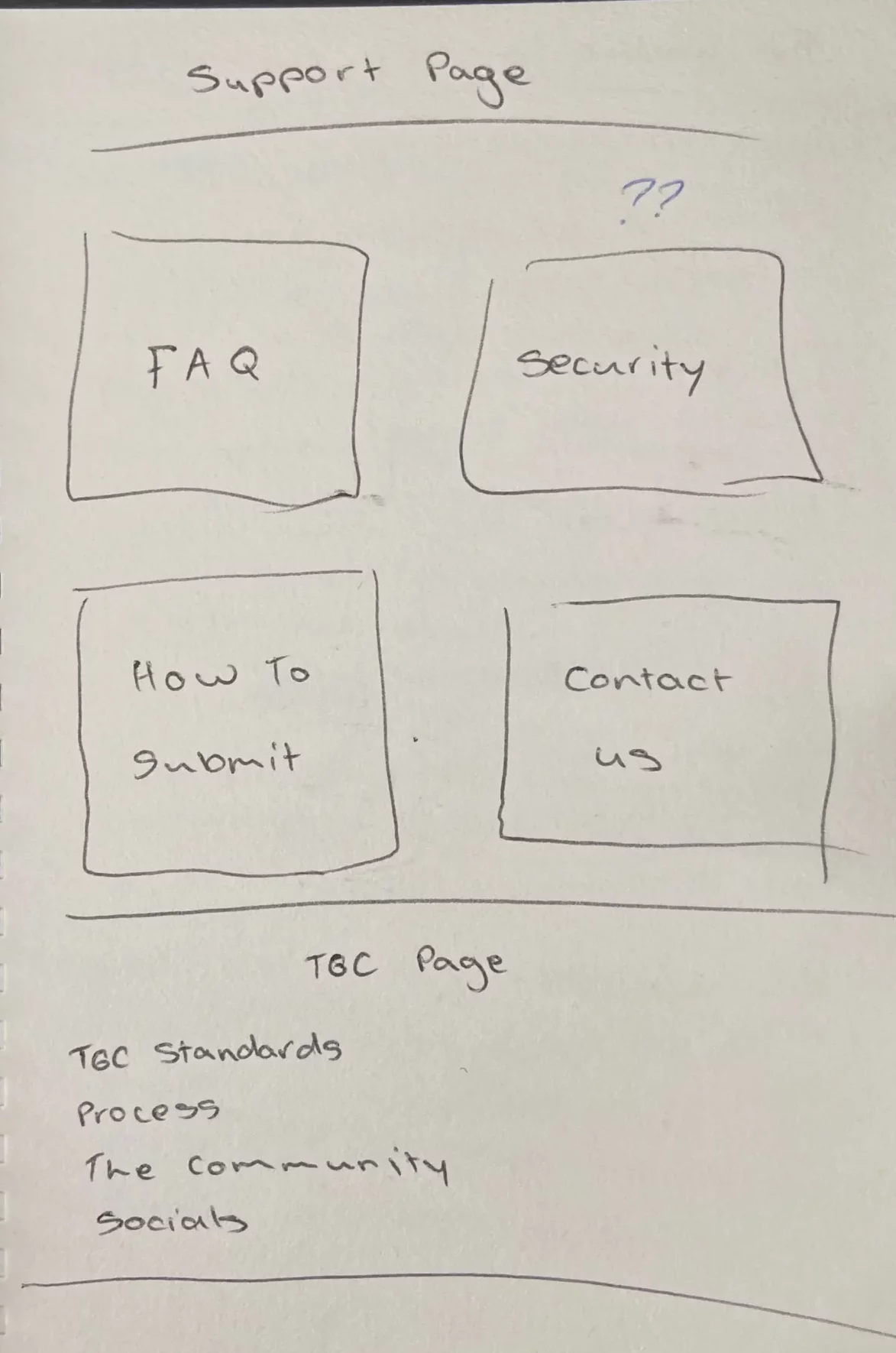
Paper Wireframes
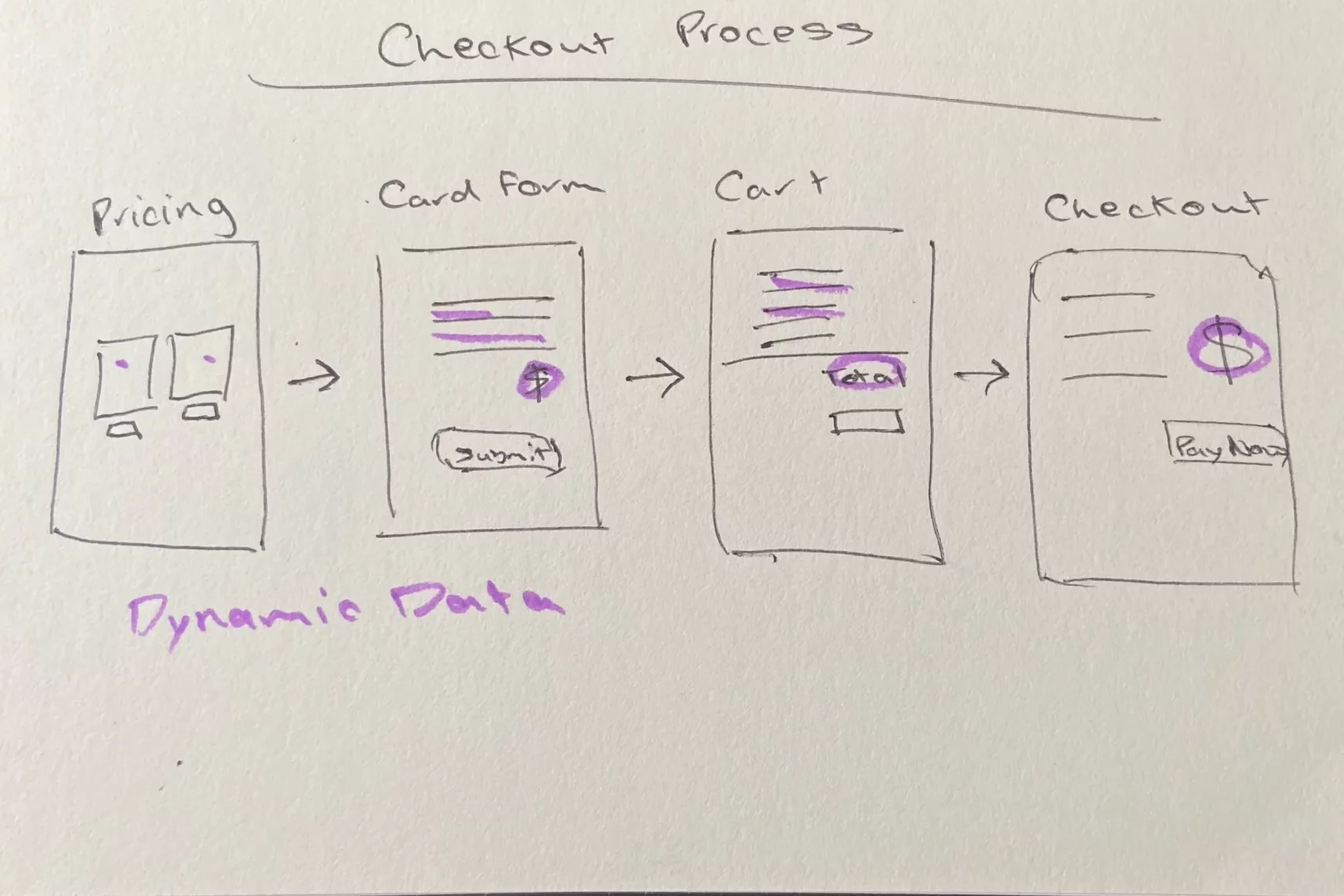
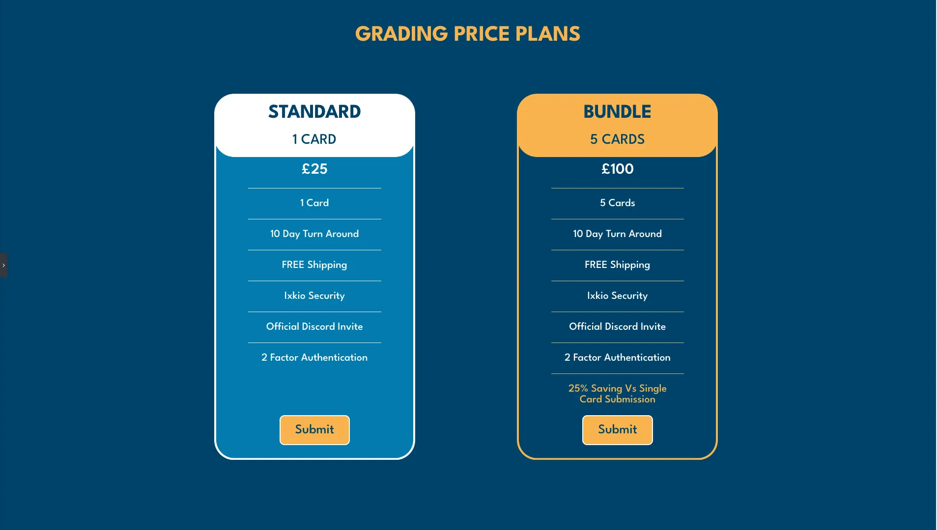
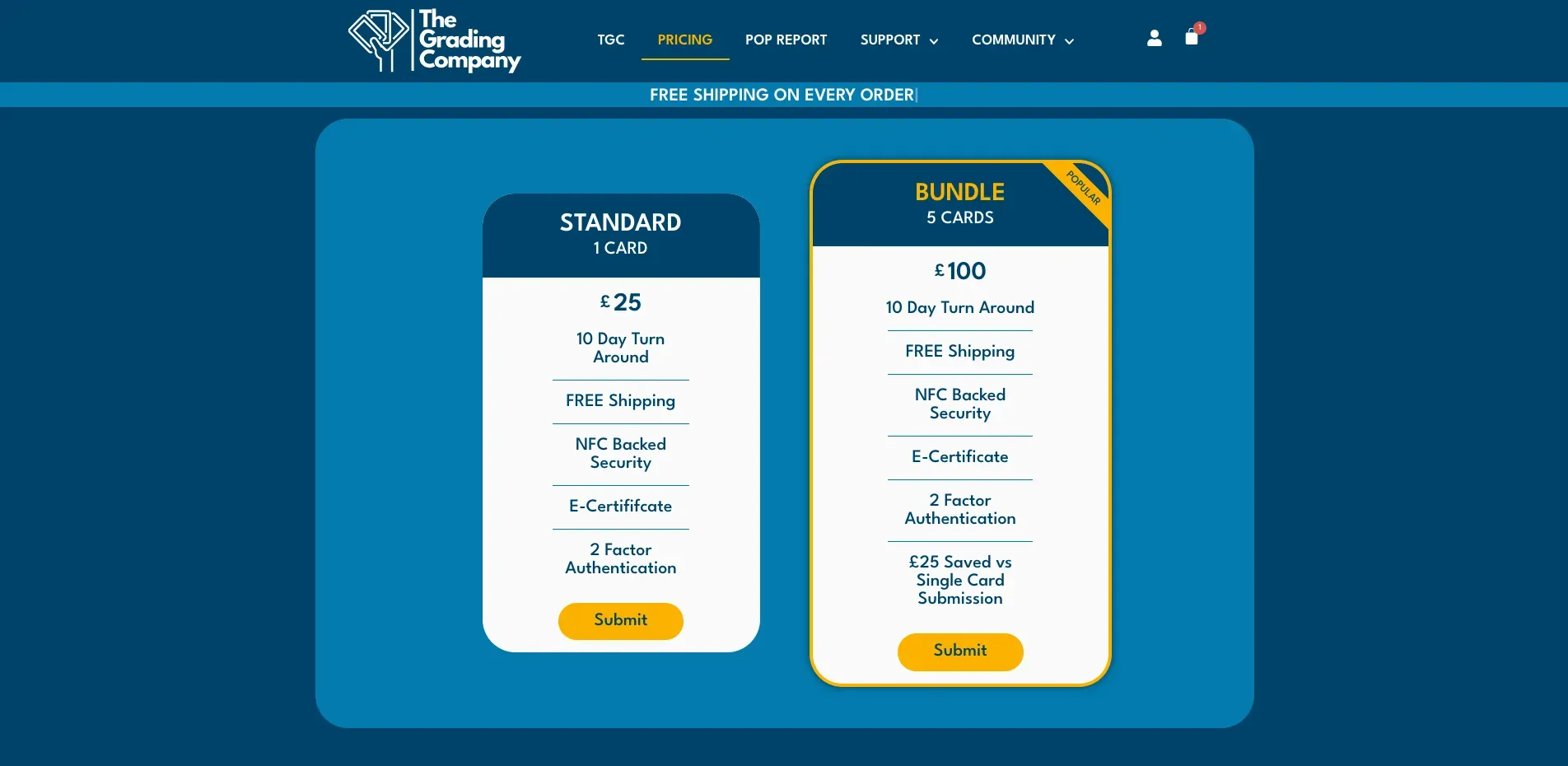
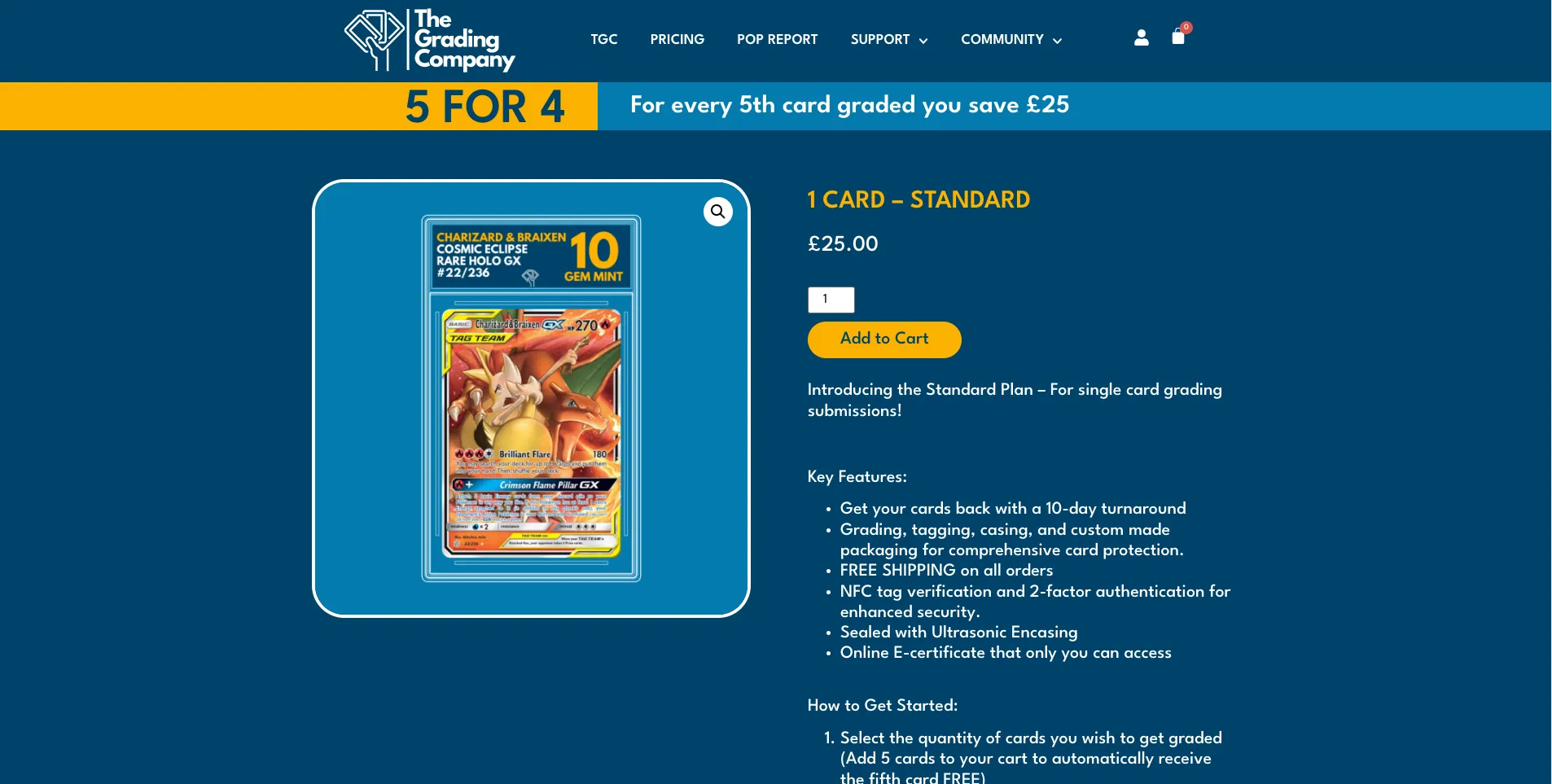
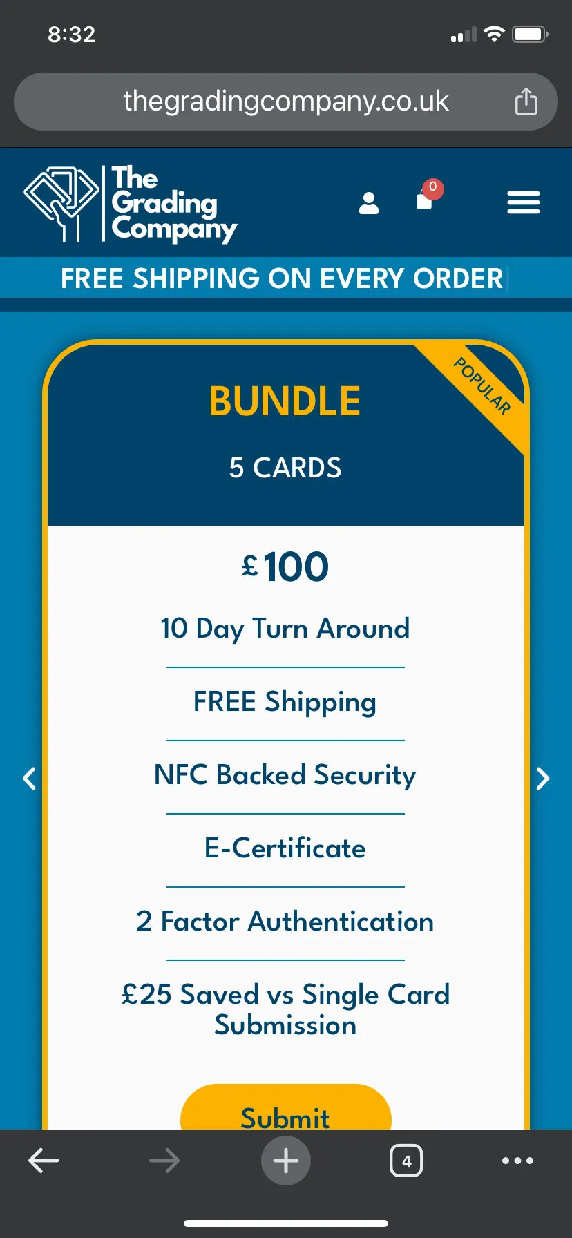
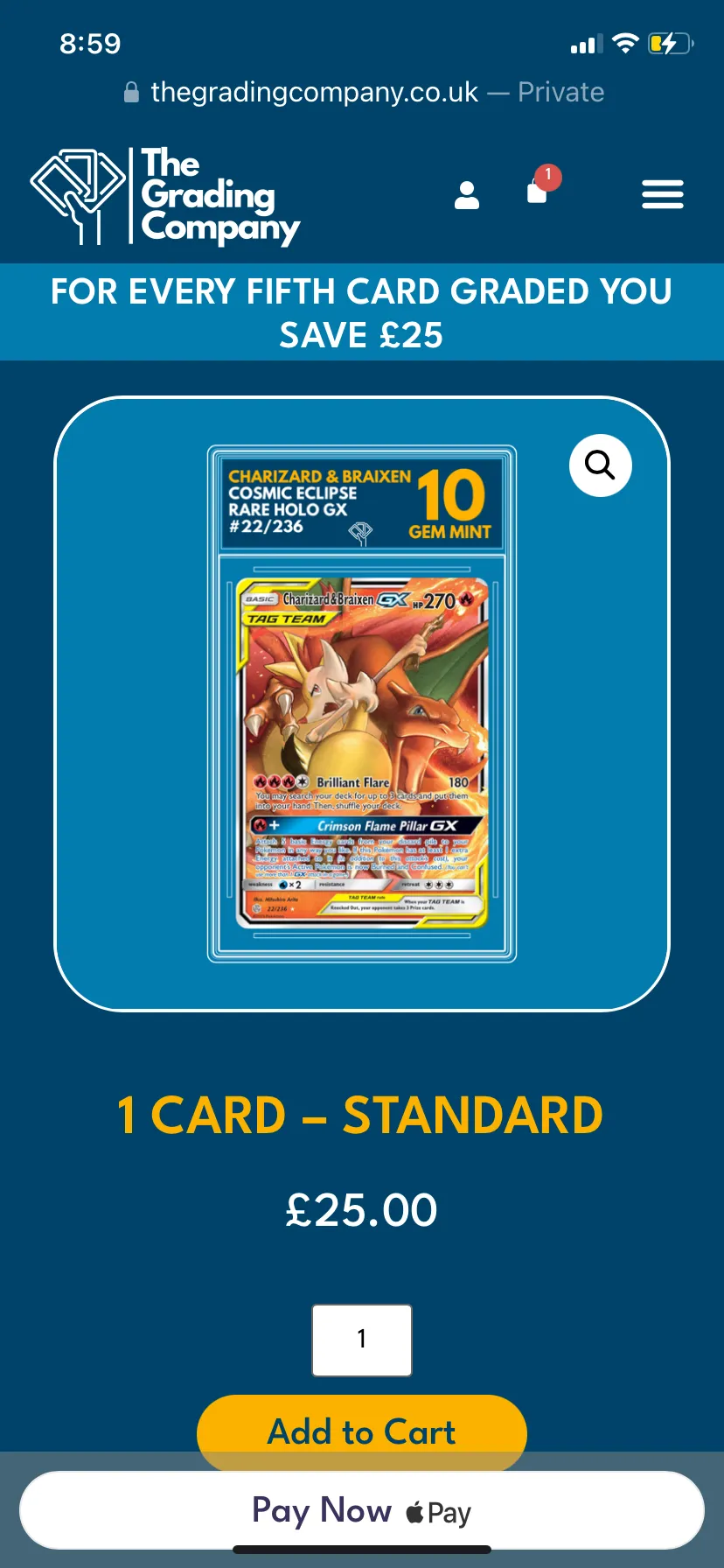
The design has changed from the early concepts but many elements stayed true to the original wireframes. The pricing page features two plan options: a 1 card submission or a 5 card bundle plan. We removed the Pokémon card details form to keep the checkout process as simple as possible.
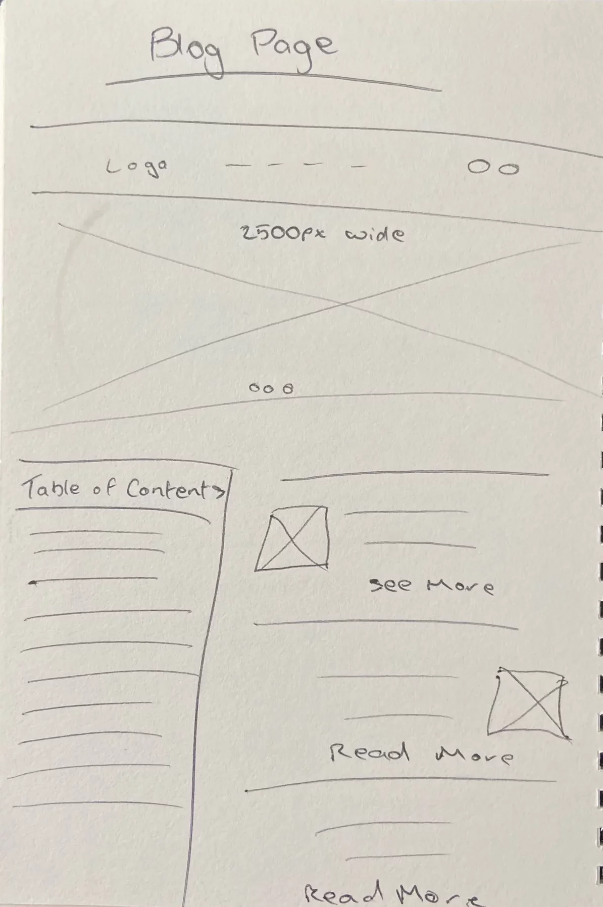
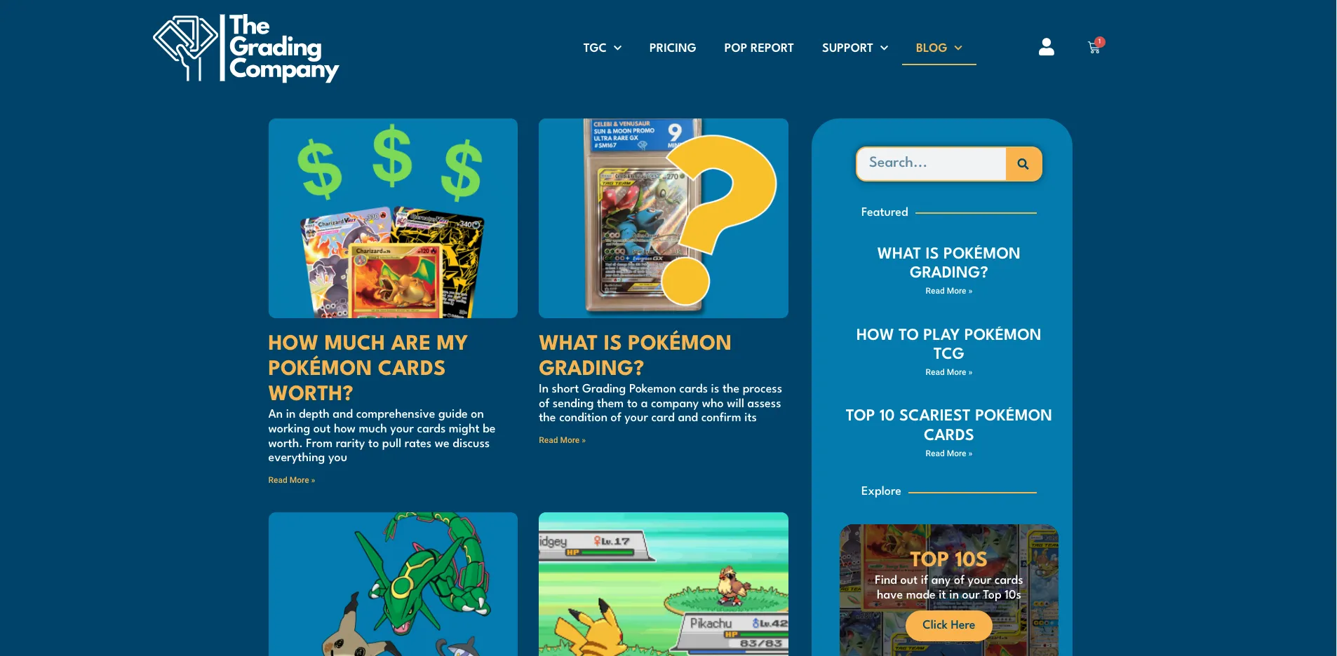
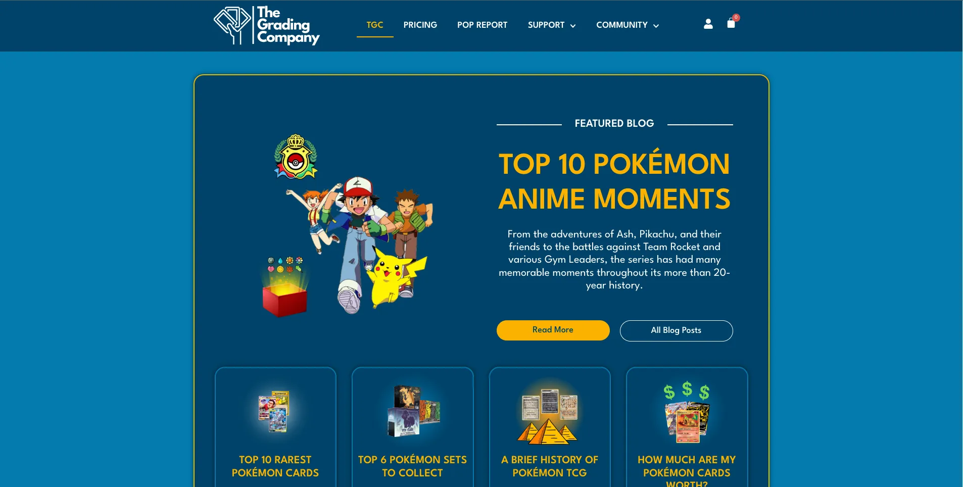
The blog page evolved significantly from the original concept. We simplified it completely and allowed the user to search for an article with the search bar or to browse by category. The newer design makes it much easier to find articles in line with the user's interests.
Early Designs
These initial designs were great for getting a feel of the overall structure and flow of the website. The actual design was very plain with nothing really grabbing the user's attention.
The 'How To Submit' page was very bland and didn't excite the user about the process. This page was later iterated on many times and is much more visually appealing now. However, constructing this page for the user really helped us clarify the card submission process and put ourselves in the user's shoes.
Usability Study
This usability study focused on how users engaged with The Grading Company website, their frustrations, pain points and any improvements that could make their experience more enjoyable.
Study Goals
The goal of the research was to make sure that users could use the website with ease and to highlight any pain points that occur in order to make the experience as smooth and enjoyable as possible.
- Can users sign up/log in to the website?
- Can users navigate the website easily?
- Is it clear how to submit cards?
- Can the user identify between the two deals offered?
- Is the user aware of the value saved in the bundle deal?
- Can users find information in the pop report?
- Can users find their card by searching POP NO.?
- Can the user find the 'My Account' page?
- Can users find their past orders?
- Are there any pain points identified?
Methodology
I conducted an unmoderated usability study with 5 participants (ages 25-65) who completed the study remotely in their own homes. Sessions took place on 3rd July 2023. Participants screen recorded the process and completed the study on a device of their choice.
Participants were asked to complete a few tasks on the website. The time it took participants to complete each task and any pain points that occurred were monitored. Participants also filled out a short questionnaire to let us know about any frustrations they had or anything they thought could be improved.
Key Performance Indicators
- Use of navigation vs. search
- Drop-off rates
- User error rates
- Time on task
- Conversion rates
Usability Study Results
Critical Issues Identified
Login/Sign-up Confusion
The login/sign-up process caused confusion for the majority of users. It did not automatically log in users after they registered, and the success notification appeared at the bottom of the form and was cut off by most users' screens.
Password Management
Rather than allowing the user to set their password, it would send them an email of their password. The overall process was very messy and was something that I had not experienced in my own testing, so this was a huge pain point that was highlighted to me.
Checkout Issues
Initially users could checkout without an account, but we learned through the usability study that this caused problems in checking users' past orders. It also caused problems for users who later wanted to create an account but the system was confused as they had used their email before to checkout.
Actions Taken
The register/login page was completely changed. Instead of going with the initial plugin that had bugs with emailing and caused frustration and confusion with the users, we reverted to the WooCommerce option.
Although the WooCommerce login/register form was not customisable, it functioned well with no bugs and clear notifications. We chose to sacrifice what we wanted it to look like visually for a better, more seamless user experience.
With the new login/register form, the user can choose their own password and is automatically logged in, avoiding any confusion.
For the checkout issue, we changed it so that users had to create an account to checkout. This was the best way to solve any confusion in the system and prevent users from having multiple accounts.
Final Design
Branding
Color Palette
Typography
League Spartan Bold
League Spartan Medium
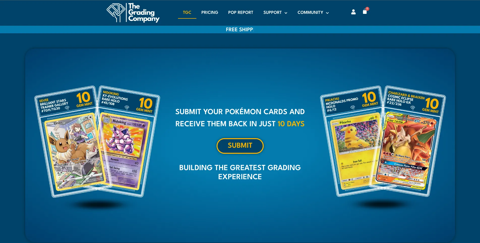
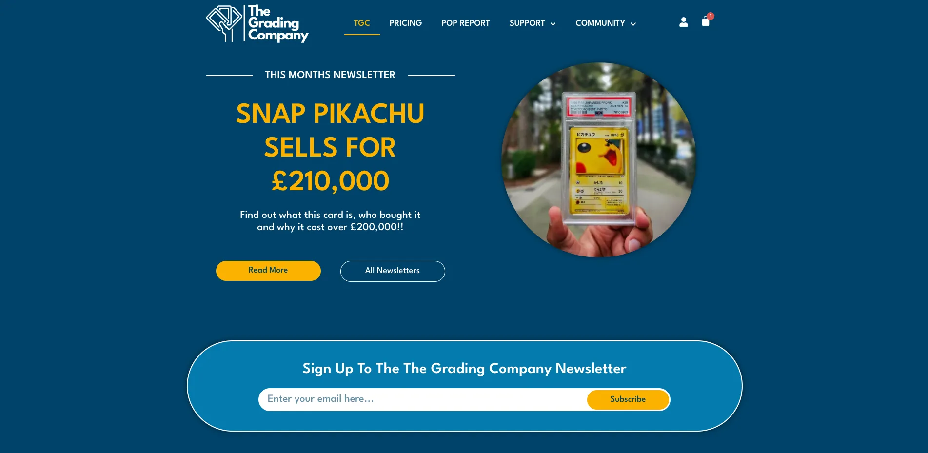
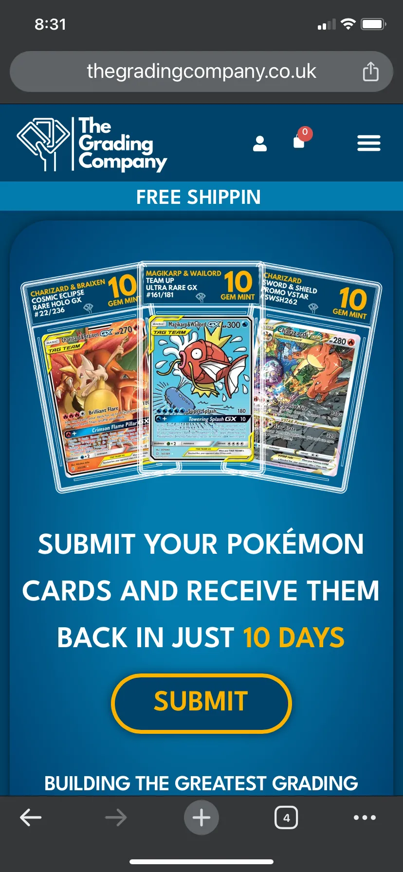
Landing Page
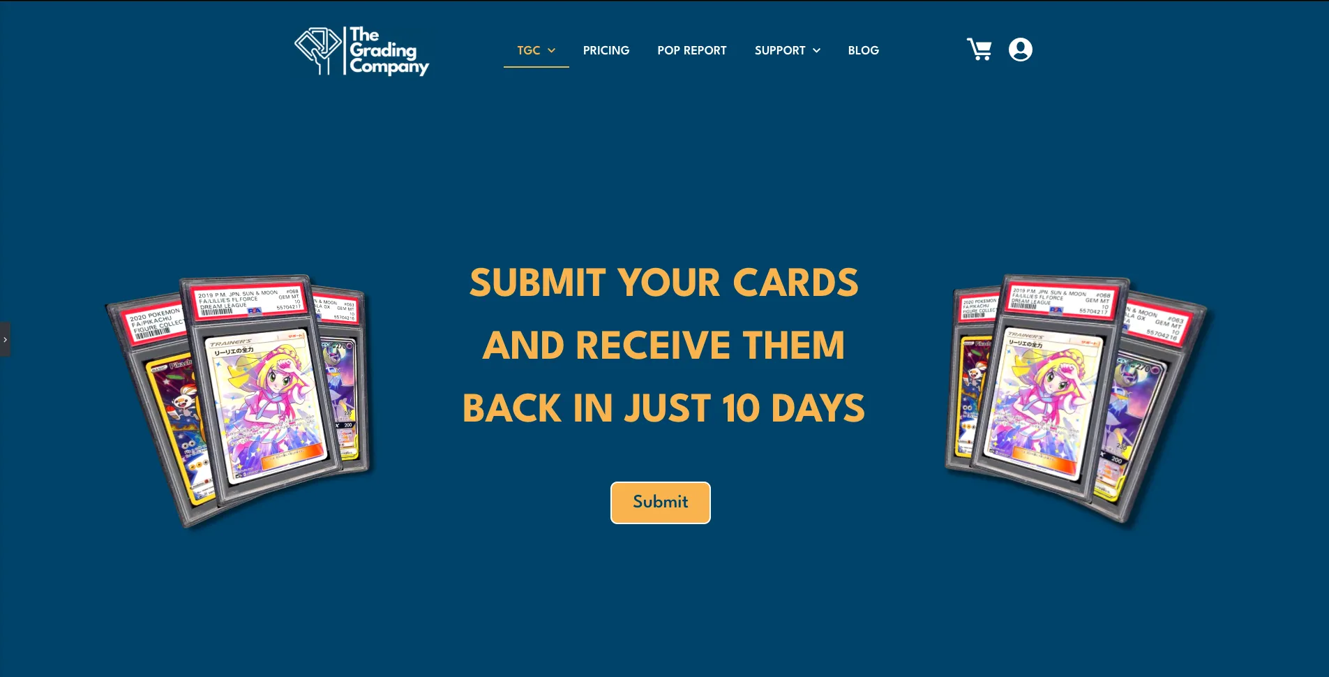
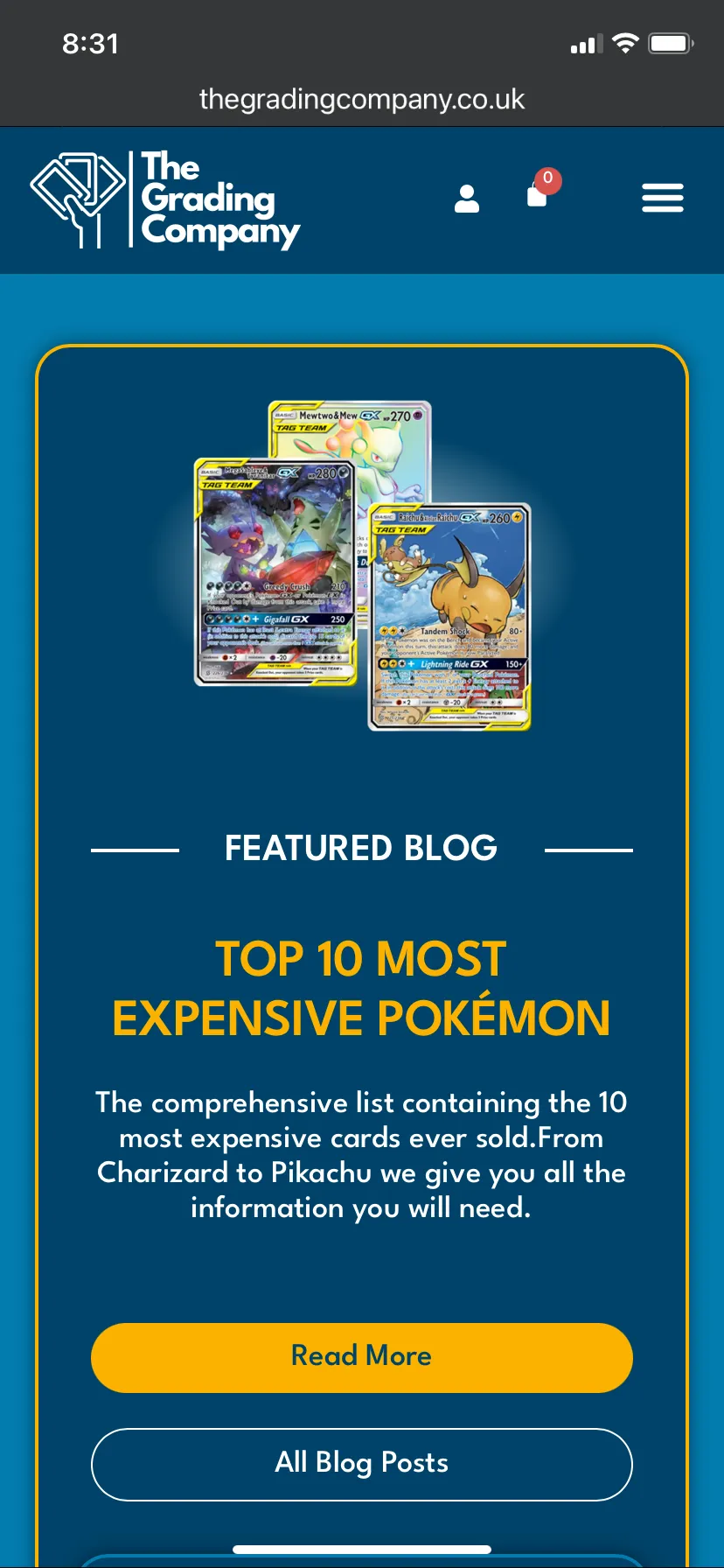
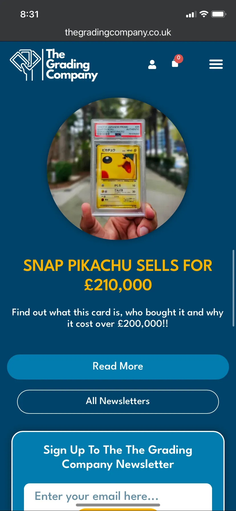
The goal with the landing page was to keep it simple, easy to use and have a really obvious call to action for customers to submit their cards.
After the main header with the submit button, we wanted the rest of the content to be valuable to the user. For this reason, we chose to feature the monthly giveaway, newsletter and featured blog post on the landing. Initially we had these three elements in a hero slider. Visually the client really liked the hero slider as it was aesthetically pleasing with lots of colour and animation. However, we decided against the slider for the final design as it was buggy and the responsive design did not translate well on all devices, making the slider unreliable. We sacrificed this design as we did not want to cause any unnecessary frustration to the user.

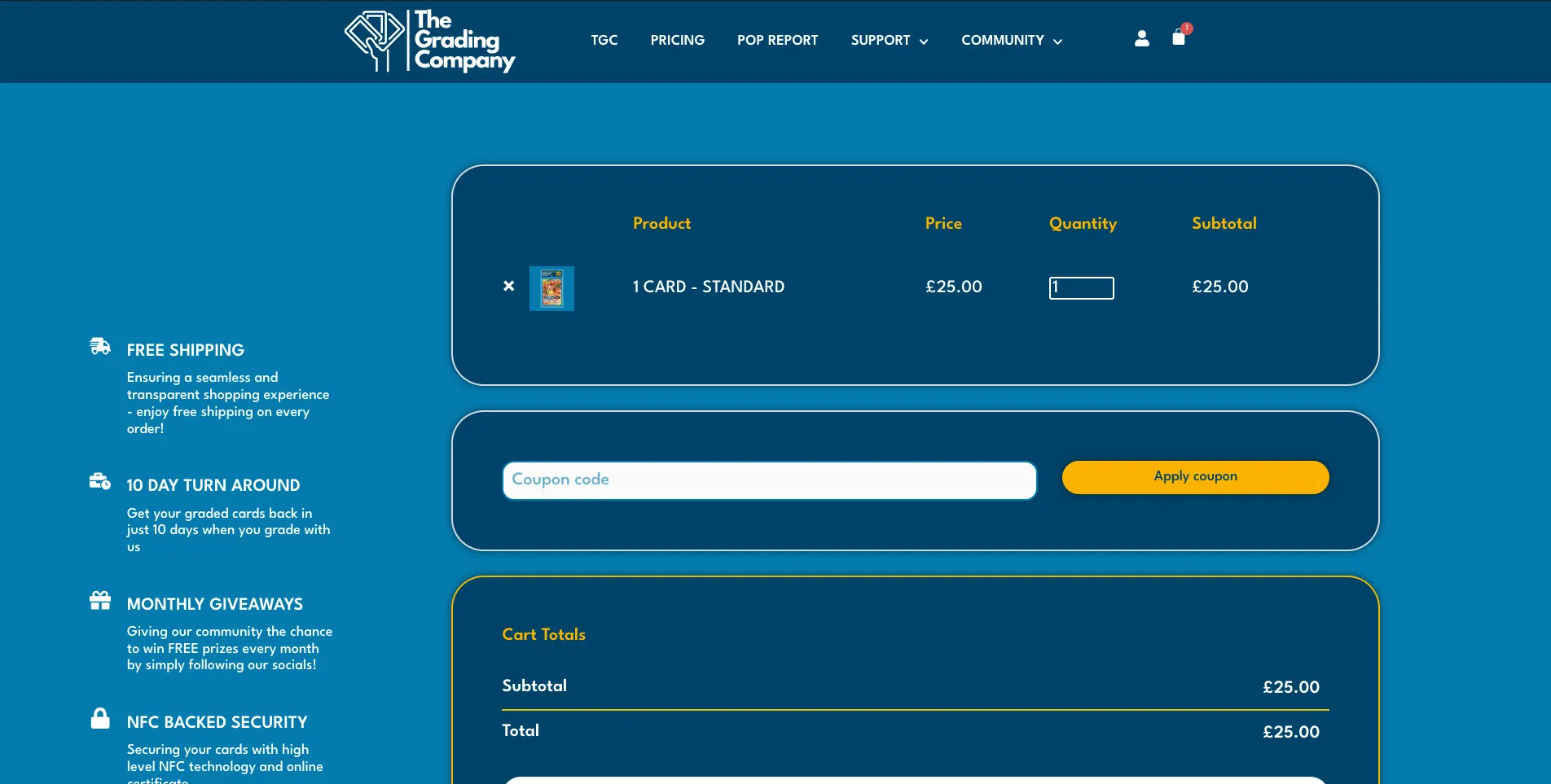
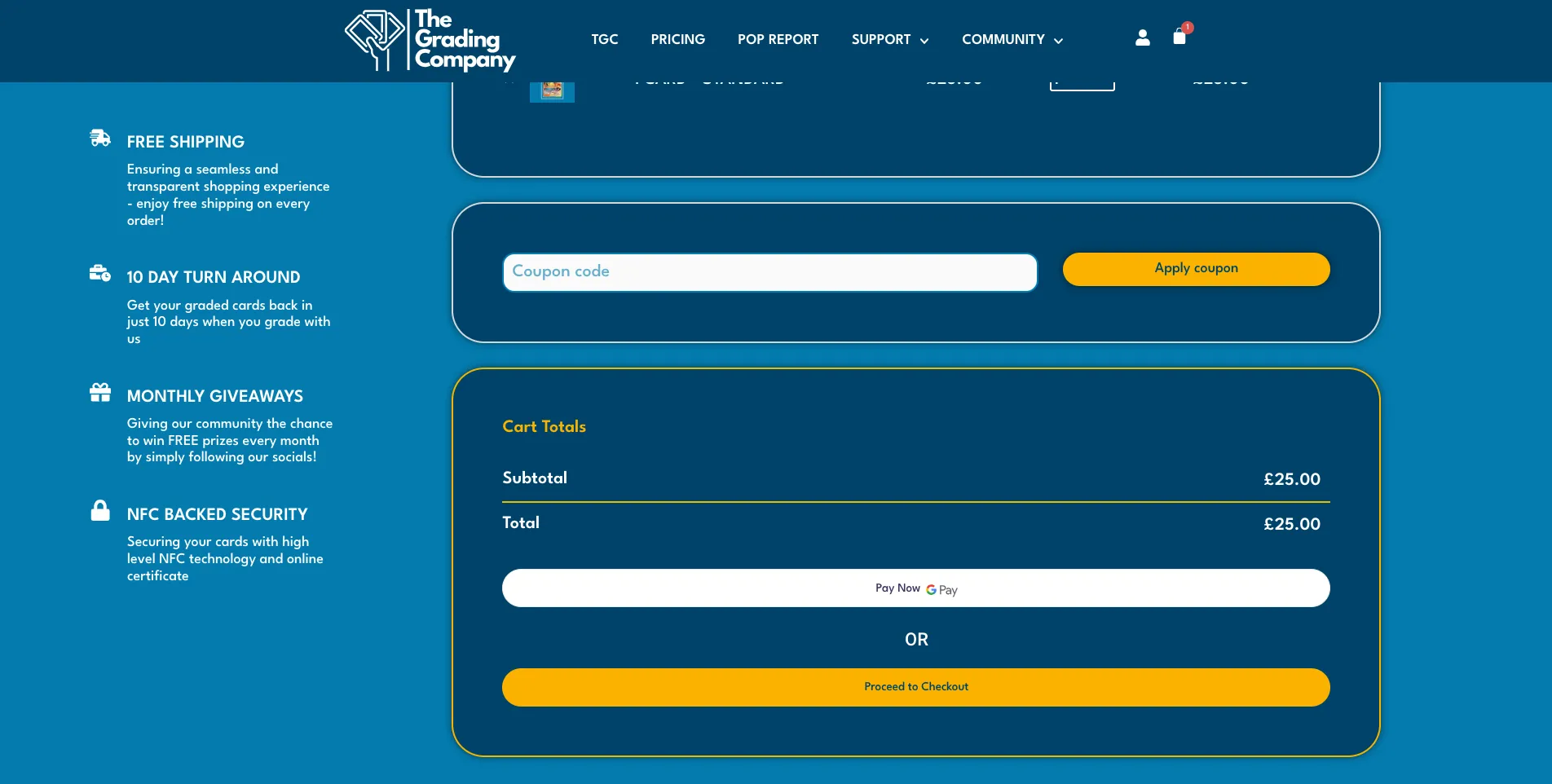
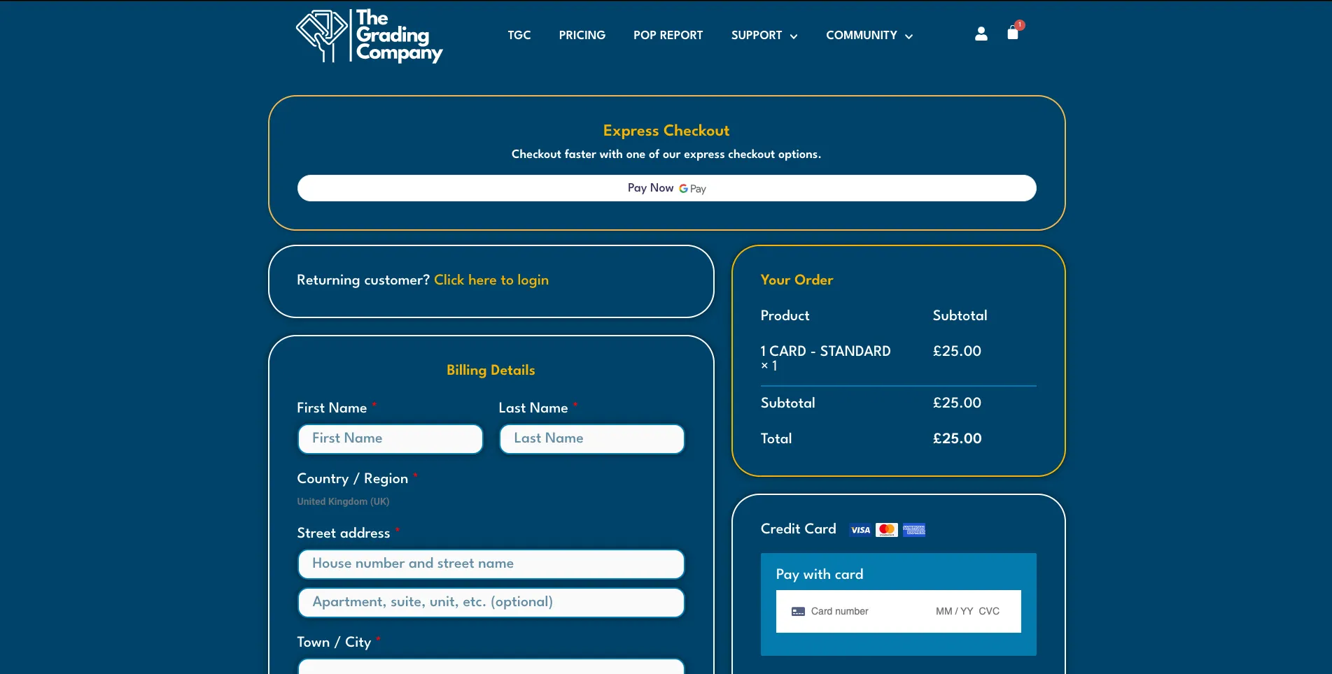
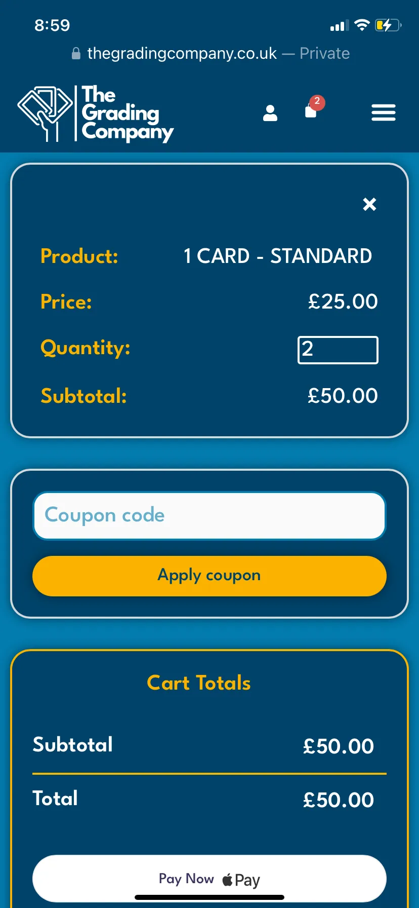
Checkout Process
The checkout flow was designed to be as streamlined as possible, with clear pricing options and minimal steps between selecting a plan and completing payment.
Responsive Design
I tried to keep the design consistent across all platforms, only making changes where it was necessary for a better user experience. For the landing page, any section with two columns side by side became one on tablet and mobile to avoid squishing all the information together on the smaller screens.
In some places where we used galleries such as the Instagram feed and blog post, I reduced the number of columns to make it fit better on mobile.
We found that it was better to change up the pricing plans for the mobile design to allow the user to swipe through the plans and make it clear that they can do this with navigation icons. Before this change, the user would have to scroll down to see other plans and it wasn't clear that you had to do this. It was too squished to put the two plans side by side, so the slider option worked best in this case.
Accessibility Considerations
Colour Contrast
The client had already chosen the colours and branding when I joined the project. However, I was careful to use these colours in a way that ensured sufficient contrast, aiding users with visual impairments in reading and comprehending content.
Alt Text for Images
All images on the site include descriptive alt text, making visual content accessible to those with visual impairments.
Typography
Sans serif font chosen as it is easy to read. Font size is large enough to read for most, with the smallest font used being 16px on mobile (size is adjustable using accessibility plugin). Font weight is mostly bold with the lightest being 500 medium used for the body text.
Interactive Elements
All of our buttons have a colour change on hover to emphasise that they are clickable. Most of the buttons also have a grow animation where suitable for extra emphasis. Tab allows the user to move across all the buttons and any form input fields.
Accessibility Plugin
Although the website was designed with accessibility in mind, we also used a plugin called 'One Click Accessibility' to help ensure that the site is as user-friendly as possible. This plugin offers features including: increase text, decrease text, greyscale, high contrast, negative contrast, light background, links underline and readable font.
SEO Strategy
Keyword Research
I started by brainstorming a list of seed keywords related to the industry, such as "Pokémon card grading UK," "UK card grading services," "The Grading Company UK," and other relevant terms.
I used keyword research tools to provide insight into search volume, keyword difficulty and related keywords. These tools were also useful in generating blog post titles to help us in creating blog posts to boost SEO.
I analysed our competitors in the UK Pokémon card grading industry and examined their websites, looking for keywords they are ranking for and any gaps in their keyword strategy.
Content Strategy
We used content initiatives to help boost SEO for the website:
- Blog posts: Regularly publishing high-quality, informative blog posts creates fresh content that search engines prioritise and helps attract backlinks
- Newsletters: Keep our audience engaged and drive traffic to the site through links within newsletters
- Monthly giveaways: Create buzz and increase user engagement, with entry requirements encouraging social sharing and website visits
Outcomes & Learnings
Results
The website successfully launched and is currently live, serving Pokémon card collectors across the UK. The comprehensive UX process resulted in a platform that not only handles card submissions efficiently but also fosters a sense of community through giveaways, newsletters, and blog content.
The usability testing phase proved invaluable in catching critical issues with the login/registration system that I had not experienced in my own testing, demonstrating the importance of testing with real users across different devices and scenarios.
What I Learned
This project taught me the importance of prioritising user experience over visual preferences. When the hero slider proved buggy and unreliable on different devices, we made the difficult decision to remove it despite the client's initial preference. Similarly, when the custom login plugin caused confusion, we switched to a less customisable but more functional WooCommerce solution. These decisions reinforced that a seamless user experience should always take precedence over aesthetic desires.
The value of comprehensive usability testing became clear when participants uncovered critical issues I hadn't discovered during my own testing. The login/registration confusion and checkout problems would have significantly impacted user satisfaction if they had gone undetected.
I also learned to balance client vision with user needs. The client had a strong vision for the brand and website aesthetics, but my role was to bring that vision to life while keeping the user at the forefront of every decision. This required clear communication about why certain design choices needed to change based on user feedback and research findings.